Brock's Gap Brewing Company
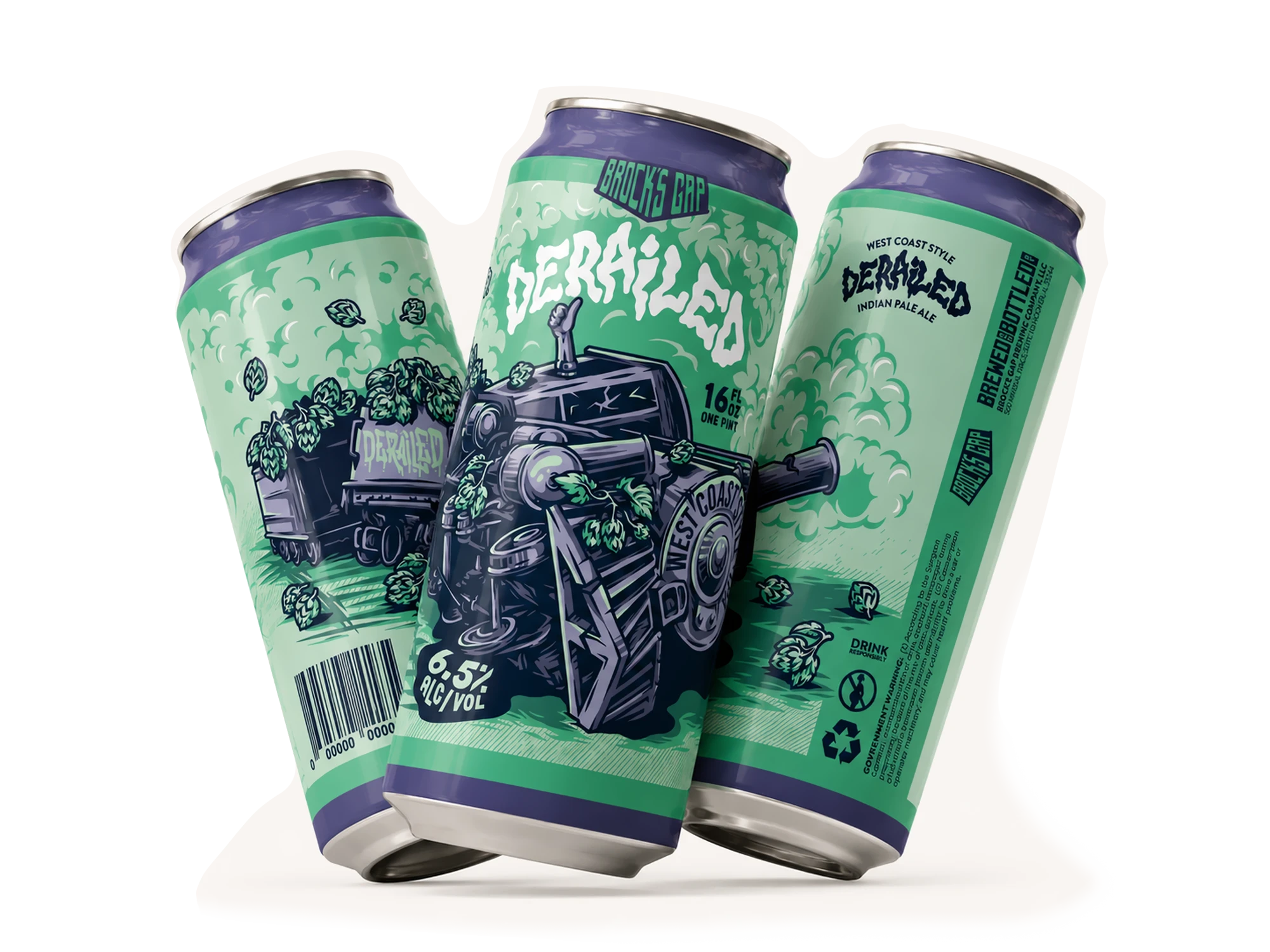
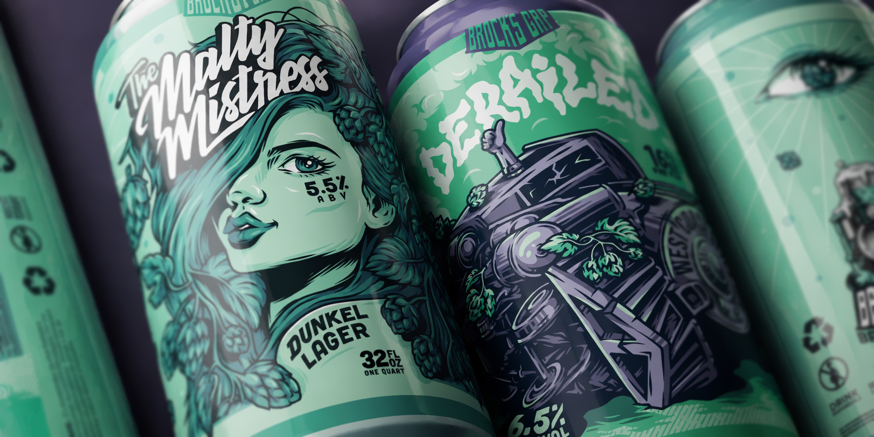
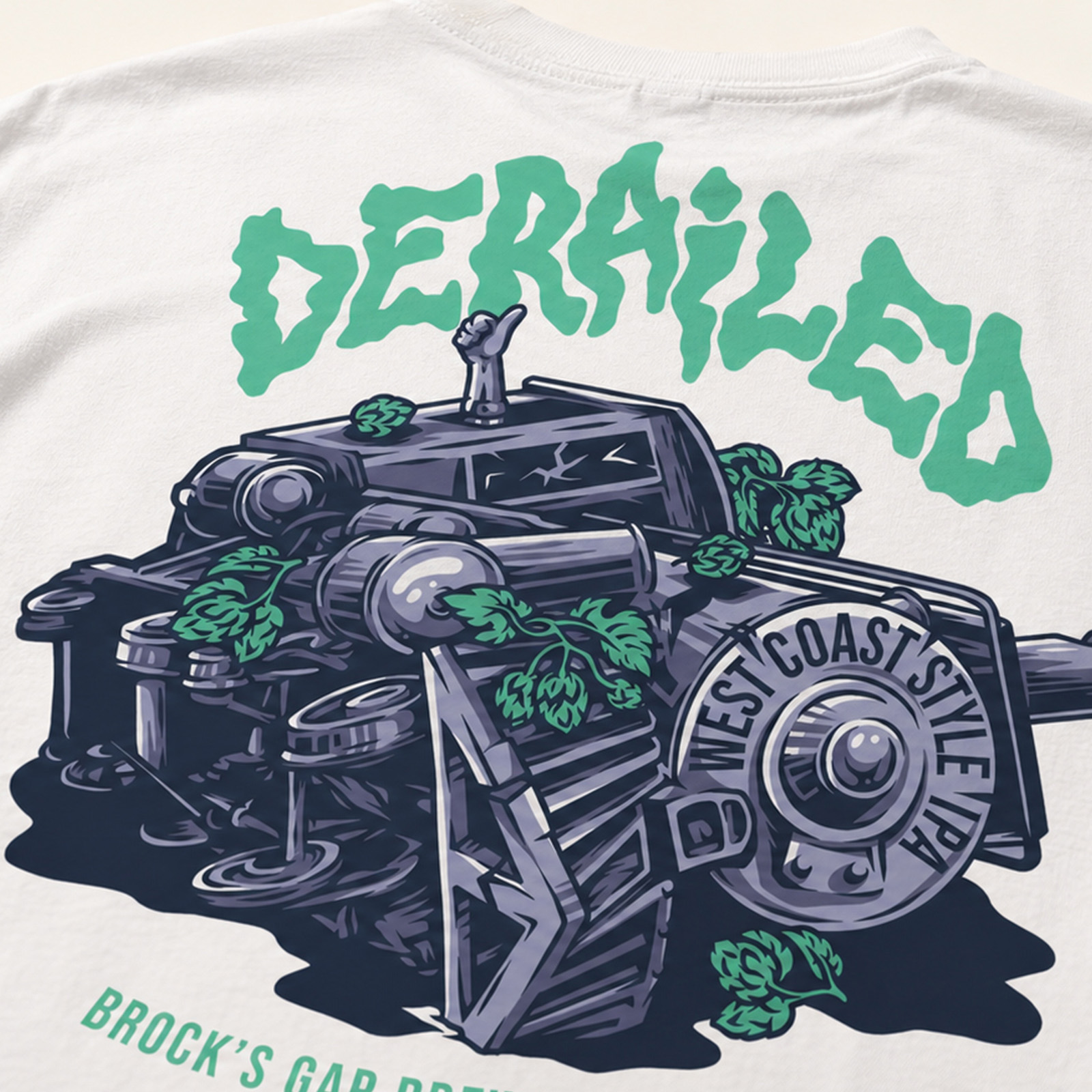
We developed the visual identity for Brock’s Gap Brewing Company, creating branding and an illustration-led design system that extends across their beer packaging, taproom and merchandise. Individual releases were given their own character and visual language while remaining connected through a bold, graphic approach to illustration and lettering.
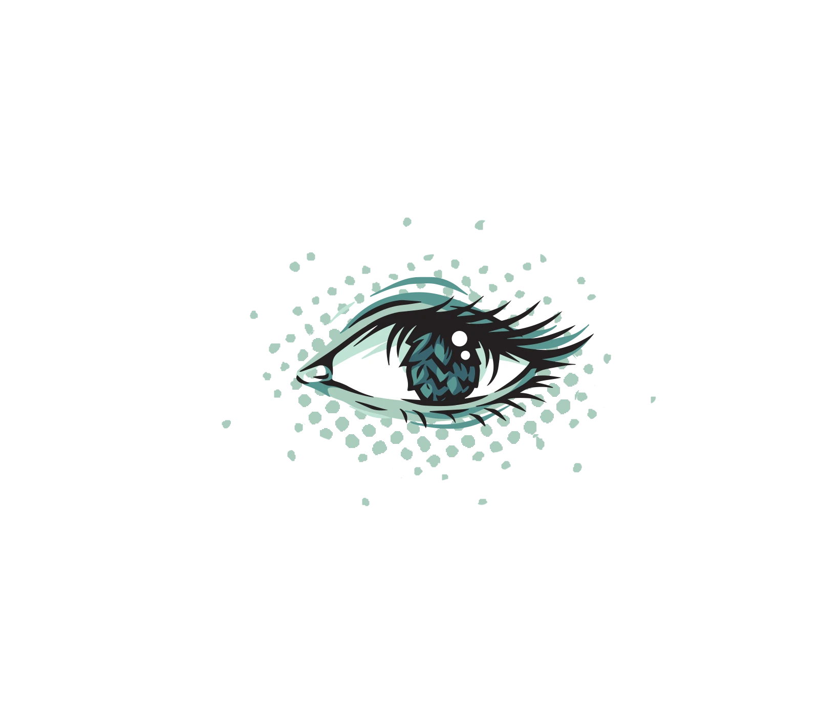
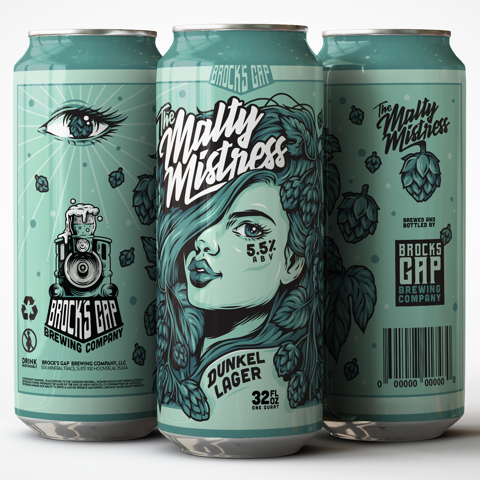
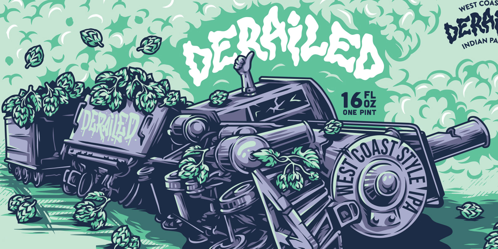
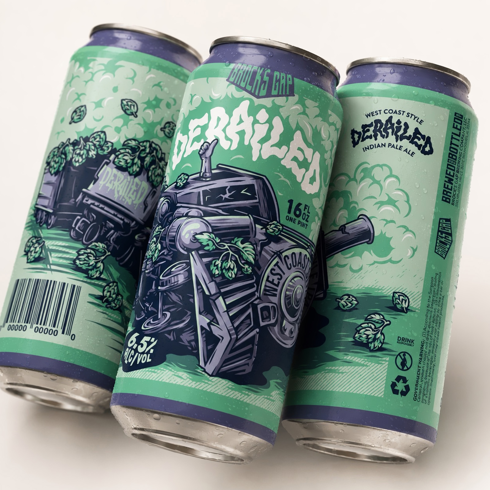
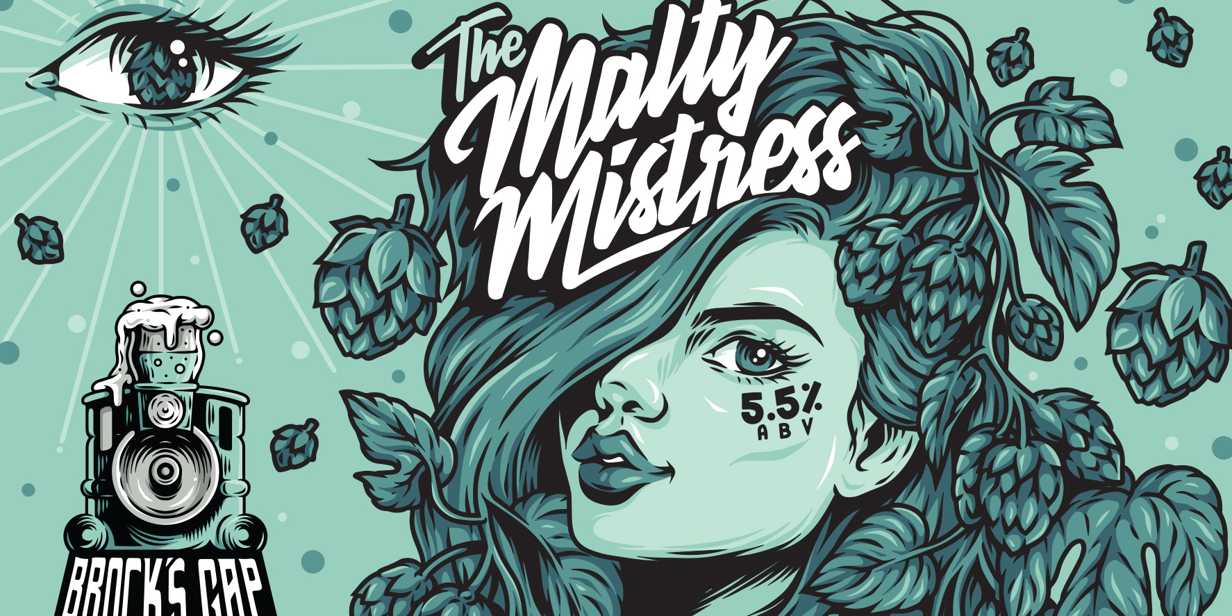
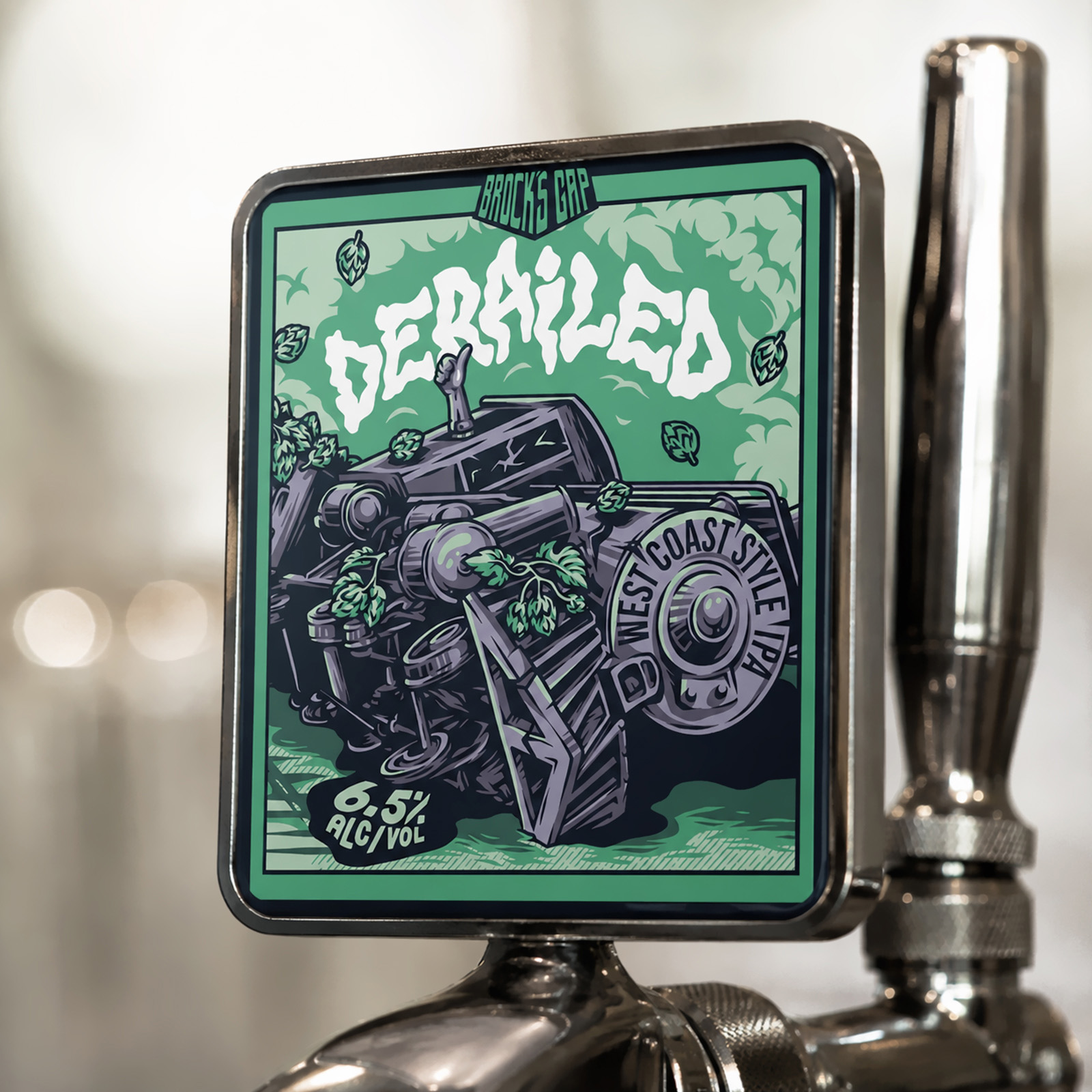
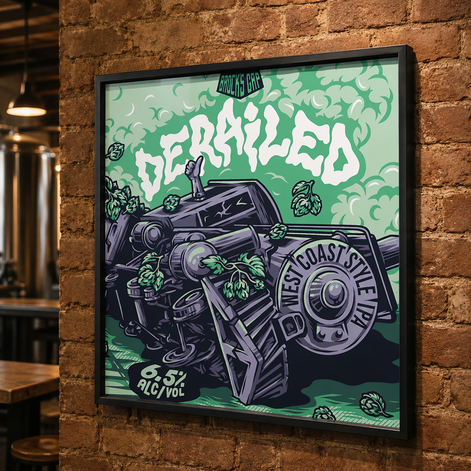
For The Malty Mistress, we created a hop-covered title character and custom lettering for the brewery’s Dunkel Lager. Derailed takes a completely different direction, transforming a steam locomotive into a hop-loaded mechanical character for the West Coast IPA. Both designs wrap illustration around the packaging, using the full can as a canvas rather than treating the artwork as a conventional front-facing label.
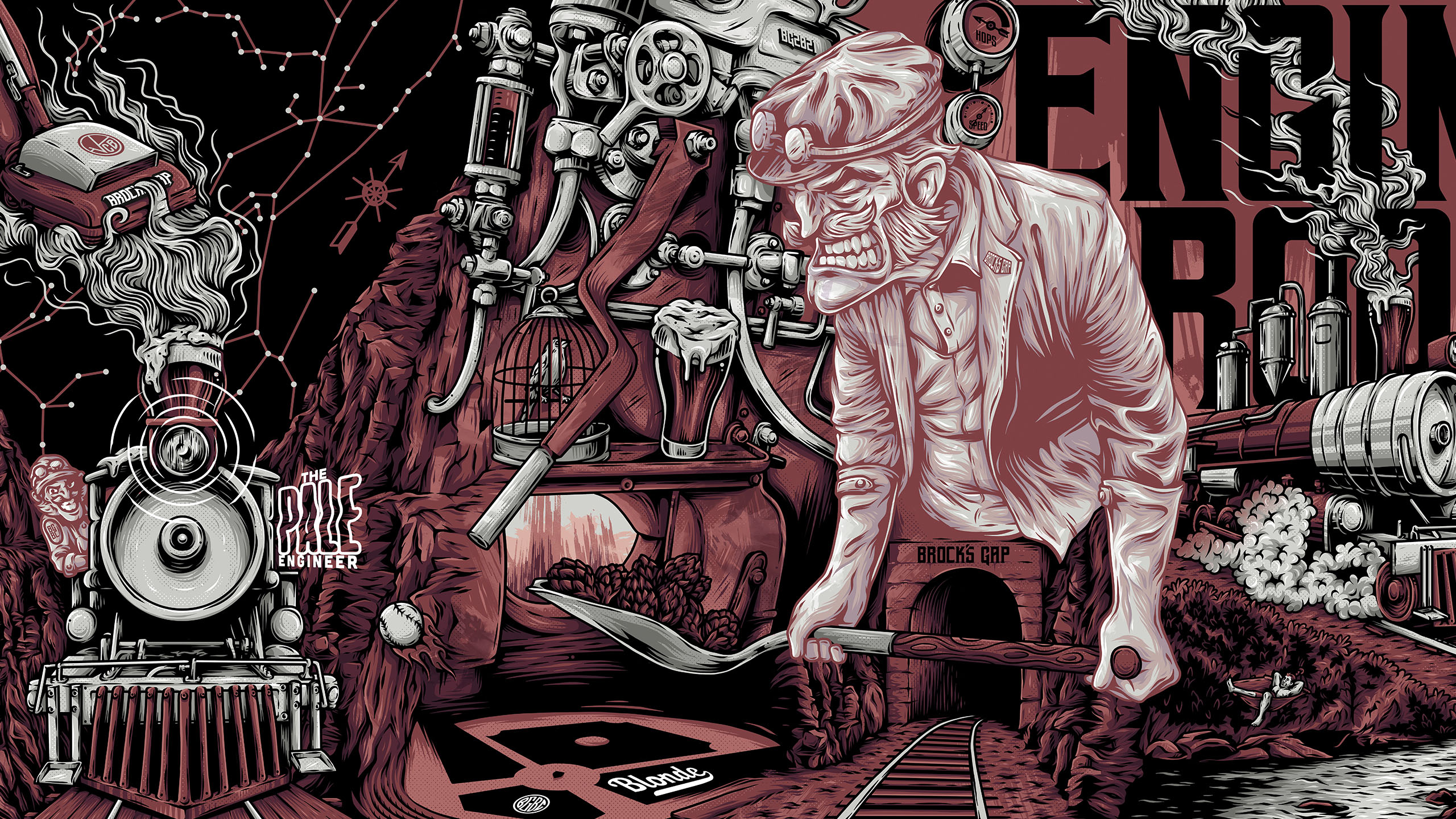
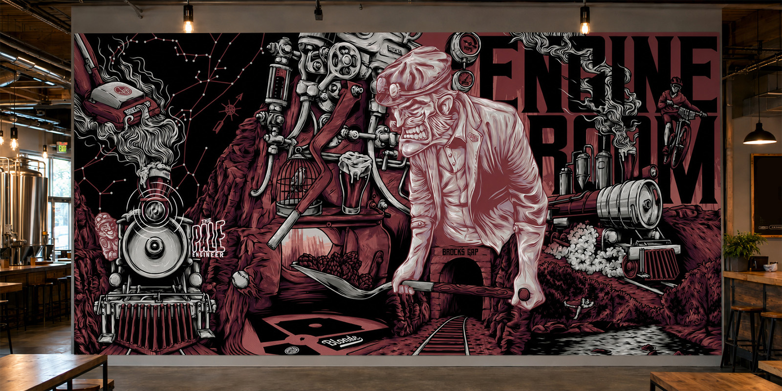
Our work with Brock’s Gap also extended into the brewery itself, including a large-scale illustrated taproom mural bringing together brewing machinery, rail imagery and characters within one continuous scene. The result is a visual identity that moves between packaging, environmental graphics and merchandise while giving individual beers room to develop their own personality.
Got something cool in mind?
Whether you’re creating an album, launching a product or building a brand, original illustration has the power to make people stop, look and remember. If you have an idea you’d like to bring to life, we’d love to hear about it.
Start Project →